Compare your stats over time
You can compare your website stats over time to spot trends and measure progress. The comparison feature lets you analyze one date range alongside another.
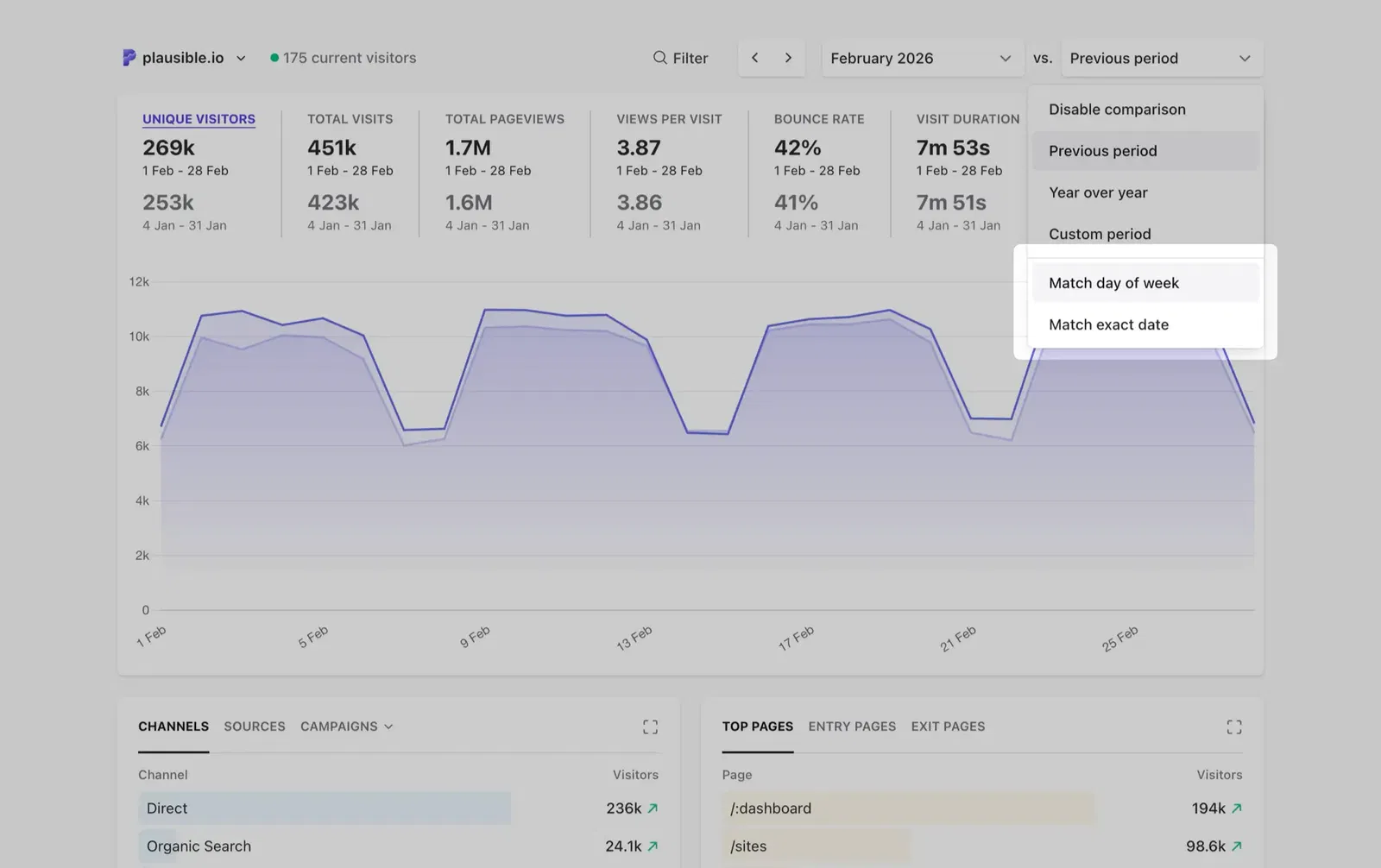
Once enabled, the comparison drop-down gives you these options:
- Previous period — compares against the period immediately before your selected date range
- Year over year — compares against the same period in the previous calendar year
- Custom period — compare against any date range you choose
- Match day of week — aligns the comparison by day of the week to avoid weekend/weekday skew
- Match exact date — aligns by calendar date instead
You can also change the chart interval, segment your audience to focus on specific traffic, and compare against imported Google Analytics stats if available.
How to compare two different date ranges
-
Select your primary date range using the date picker in the top right of your dashboard or by using one of our keyboard shortcuts.
-
Then select Compare in the date picker or press
Xon your keyboard to enable the comparison feature. -
Choose your comparison option from the drop-down.
The comparison appears in three places across your dashboard:
- Metric cards at the top show percentage changes (with up/down arrows) against the comparison period
- The main chart shows both date ranges as separate lines so you can see trends side by side. Hover over any point to see the values and percent change in the tooltip
- Breakdown tables (Sources, Pages, Countries, etc.) show comparison data in a tooltip when you hover over a row
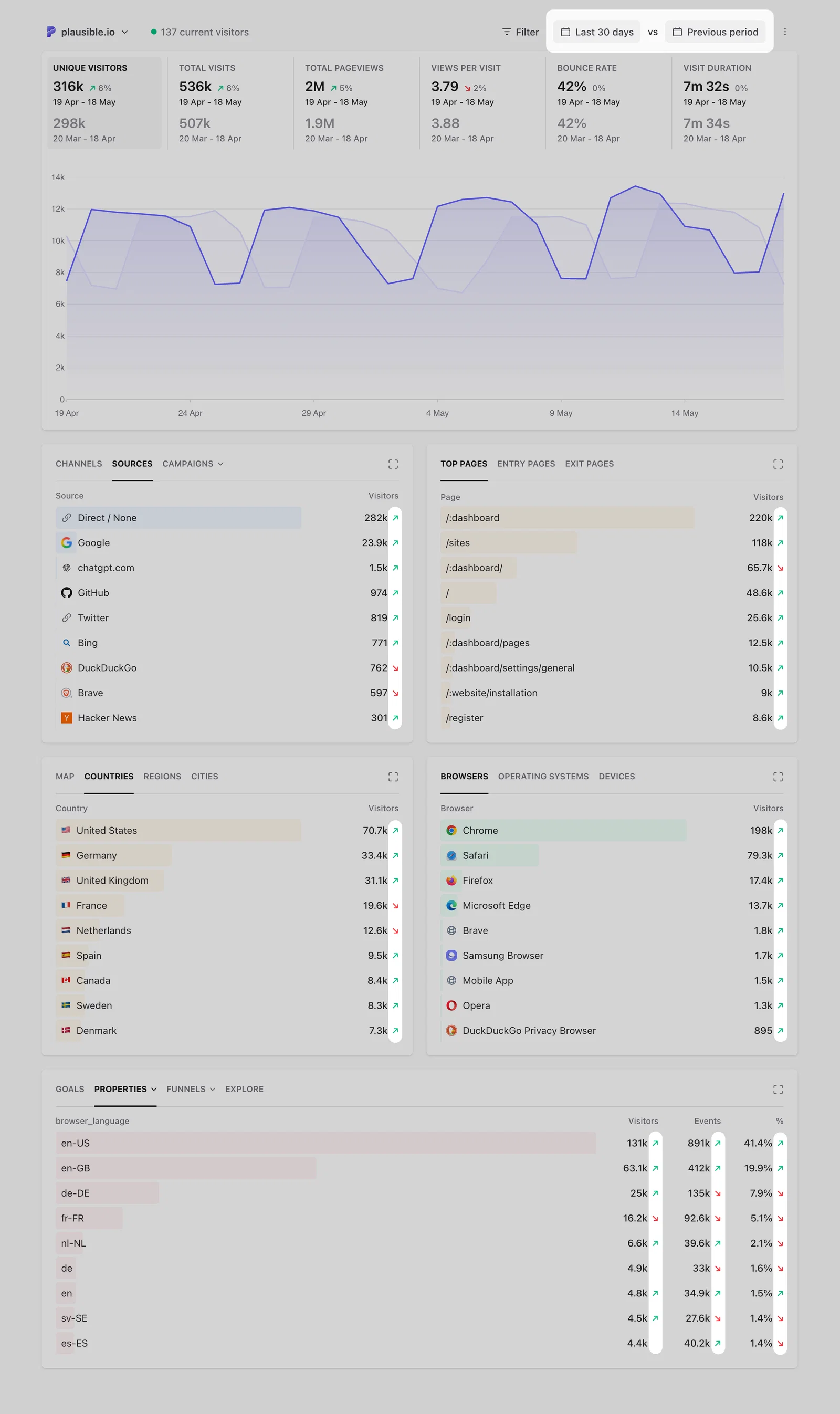
As with everything else on the dashboard, we'll save your comparison preference for your next visit.
- Want to disable the comparison and get back to the regular view? Press
Xon your keyboard or choose Disable comparison in the comparison drop-down.
Segment your audience
First, filter the dashboard in any way you want to segment your audience. Filter by a group of pages, traffic from organic search sources or visitors from a specific geographical region. Then enable the comparison feature to analyze that particular audience segment over time and compare it to a different date range.
Choose a chart interval
In the options menu (the ⋮ icon in the top right of the chart), you can choose the unit of time the stats on the chart are grouped by under Graph interval. This gives you a more granular comparison view. The available interval options depend on the date range you've selected. For example, if you select "Last 28 days" as your primary date range, you can display the stats by day or by week.
Match day of the week or match exact date
The comparison can be aligned by day of the week or by exact calendar date. Matching by day of the week means your primary date range is compared to the secondary date range starting with the same day of the week. This helps you eliminate discrepancies due to weekend or weekday differences.
The alternative option in the comparison drop-down is to Match exact date. When choosing Sunday January 1st to January 7th 2023 as the primary date range and matching by exact date, the year over year comparison will be against Saturday January 1st to January 7th 2022.
But when Match day of the week is selected, the comparison will be against Sunday January 2nd to January 8th 2022 instead. It's still compared to the same amount of time but the secondary date range is aligned by day of the week to get more accurate data.
Available comparison options
Here are the details on the available comparison options:
Previous period
Your primary date range will be compared to the same amount of time in the period before it. If you select Last 7 days as your primary date range, the stats are compared to the previous seven days before it.
Year over year
Your primary date range will be compared to the same period of the previous calendar year. If you select January 1st to January 7th 2023 as your primary date range and choose Match exact date, a comparison to January 1st to January 7th 2022 will be shown.
Custom period
Your primary date range will be compared to whatever custom period you select. The custom period can be the same amount of time as the primary date range but it can be longer or shorter too.
You can compare whatever primary date range you want with whatever custom period you want. This is useful for seasonal holidays, marketing campaigns or any other unique goals and objectives that you have.
Custom period comparison is useful when you want more flexibility than fixed comparisons. For example:
Compare marketing campaigns of different lengths
Campaigns don’t always run for the same number of days. With custom period, you can compare any date range against another, even if one is shorter or longer. This helps you understand which campaign performed better without being limited by equal timeframes.
See how today (so far) is trending against a full previous day
When viewing “Today”, your data only includes activity up to the current hour. You can compare it against a full previous day to see if today is trending in a similar way. This is especially useful for spotting early patterns and performance changes throughout the day.
Note: this is only possible with custom period comparison. If you use “previous period”, it will compare today’s data only up to the current hour with the same time range from the previous day, to keep the comparison consistent.